👨🎓 Competencies
- User Research
- Conception
- UX Design
- UI Design
- Frontend
✨ Special Features
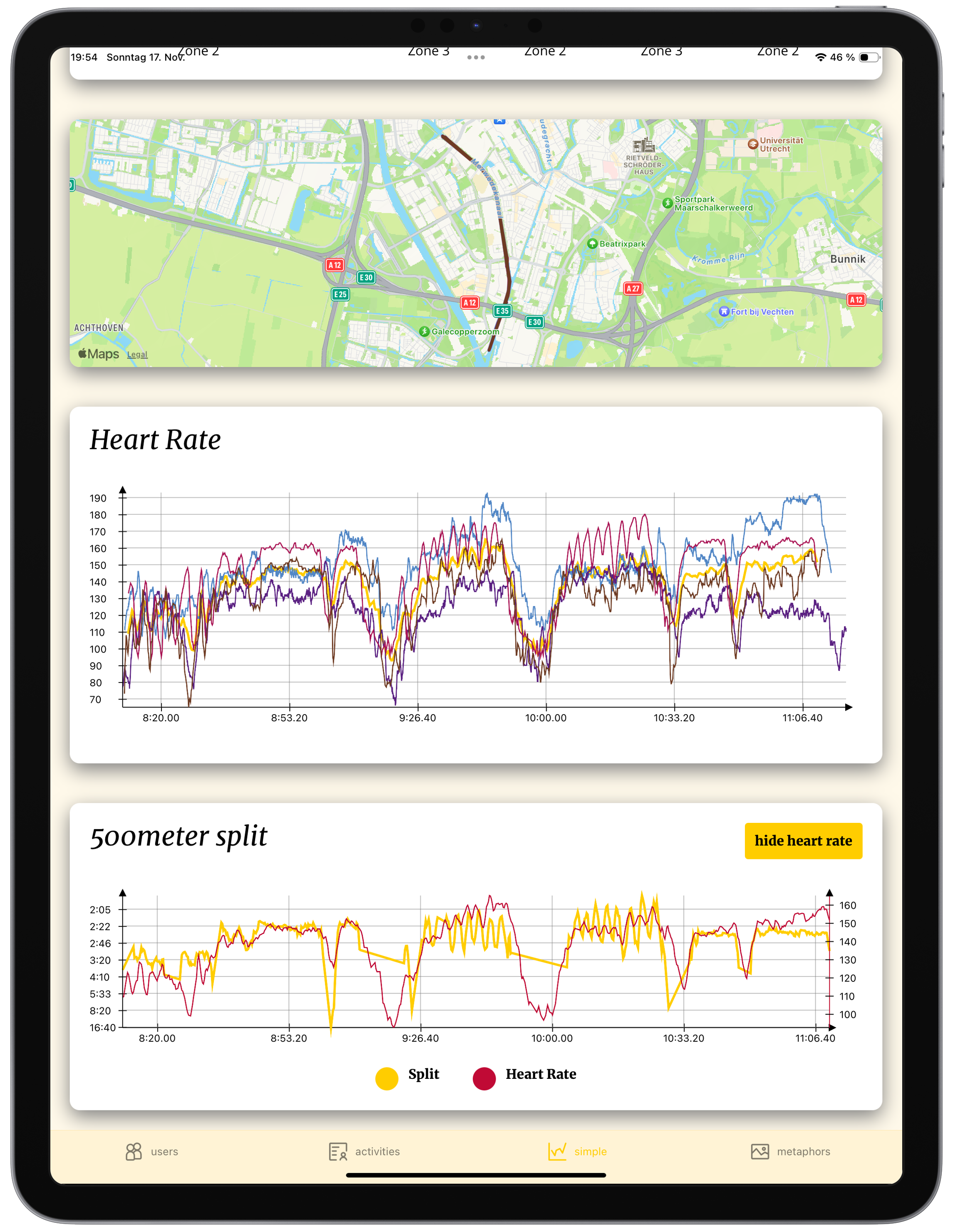
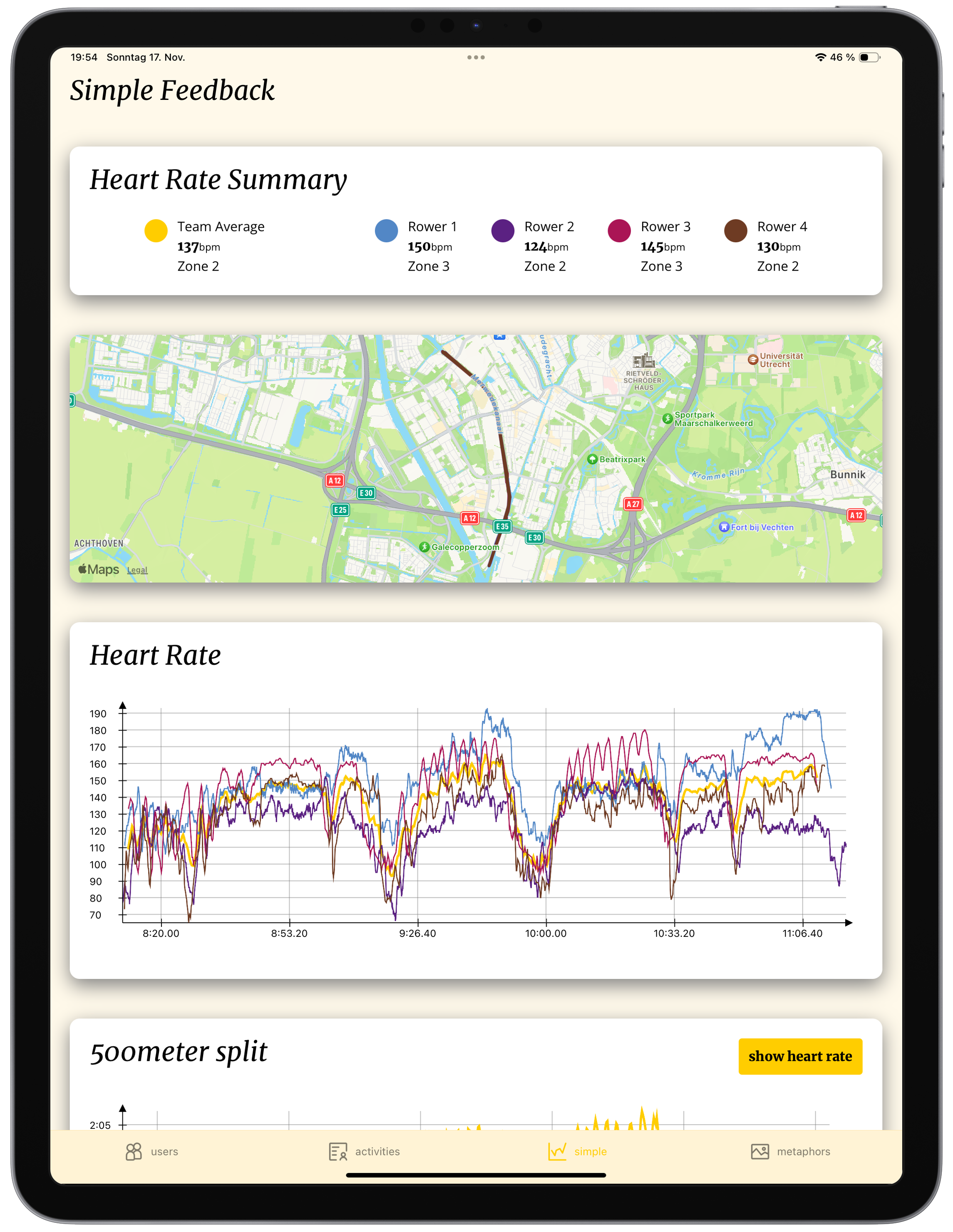
- Interactive Graphs and Maps
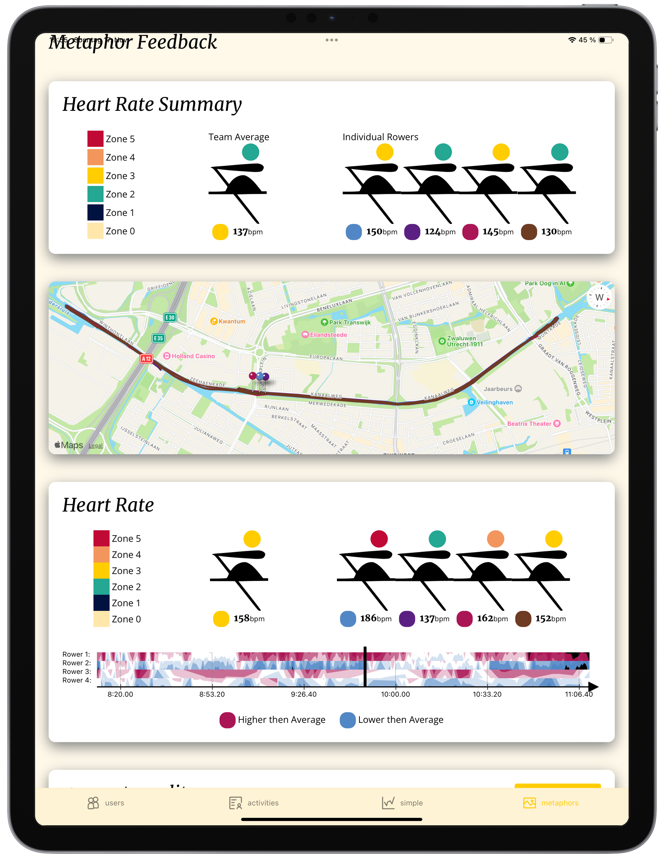
- Metaphor Visualizations
- Garmin Connect Integration
- Polar Flow Integration
👨💻 Technologies
-
 Figma
Figma
-
 D3
D3
-
 React Native
User and Literature Research
The collection and analysis of physiological data, such as heart rate in relation to speed, is crucial for athletes to precisely assess the quality of their training and adjust intensity to prescribed training plans. Particularly in rowing, where athletes act together in a boat but individual effort can vary, the comparison of heart rates is an essential element for assessing synchronicity and individual performance contribution.
There is often a need for improved visualization of collected data to intuitively grasp complex relationships and make more informed decisions. Instead of a mere accumulation of data points, clear and meaningful presentation is paramount.
In team sports, aspects such as collaboration and athlete motivation gain additional importance and can significantly influence individual and collective performance. Here, in addition to mere tracking of individual data, the focus shifts to capturing and promoting team dynamics.
The overarching goal is thus to optimize collaboration and motivation within teams and to develop appealing visualizations to make the analysis of performance data more effective and accessible.
Graphs vs. Metaphors
The use of metaphors has proven to be a promising approach to promote collaboration within teams more effectively than traditional graphical representations. When used correctly, metaphors can appeal to both competitive and collaborative personalities, thereby creating a conducive environment for common goals.
To evaluate the differential effects of metaphors and classic graphs on motivation and collaboration, an A/B test is planned. This includes two central comparison points:
First, the display of team members' heart rate data is compared. One variant shows the individual heart rate curves of all athletes in classic graphs. The alternative display uses a competitive metaphor that highlights when an athlete is in the wrong or inappropriate intensity zone compared to the team. The goal is to investigate which visualization better helps athletes optimize their effort in a team context.
Secondly, training efficiency is measured by visualizing speed in relation to average heart rate. Here, a simple graph that plots these two metrics is contrasted with a collaborative metaphor. This metaphor aims to highlight the team's collective performance and efficiency and potentially provide incentives for a more synchronized and effective execution.
Through this A/B test, we hope to gain profound insights into the extent to which the use of metaphors, compared to traditional graphs, can positively influence motivation and, in particular, collaboration within sports teams.
The Implementation
The development of this innovative project included the careful conception and design of metaphors for data visualization, which were developed in Figma. The resulting application was implemented in React Native with TypeScript to ensure cross-platform usability and high code quality. The development process was characterized by rapid prototyping, continuous testing, and swift implementation of functions using Expo.
Data integration was carried out via APIs and secure login procedures from Garmin and Polar, ensuring broad compatibility with common wearables. For the display of interactive graphs, the powerful D3.js library was used, enabling flexible and appealing data visualizations. The specially developed metaphors were implemented using Reanimated and SVGs to create dynamic and intuitive displays.
Particular attention was paid to the protection of user data. All collected information was processed in strict compliance with data protection guidelines and was never permanently stored.